
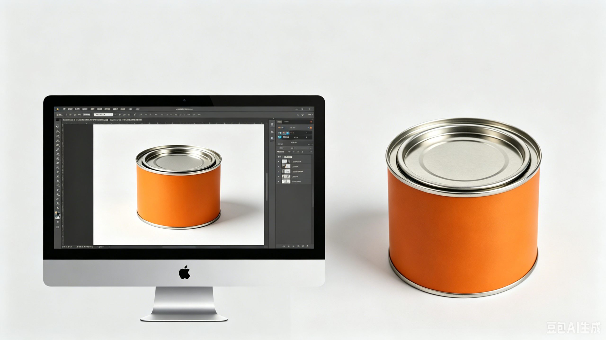
Say Goodbye to Color Differences and Printing Failures
Tin cans are widely used in industries such as food, tea, cosmetics, gifts, and cultural products because of their:
- Premium texture
- High hardness
- Excellent sealing performance
- Strong adaptability for custom packaging
However, color printing is one of the biggest challenges in tin can customization.
Many brands encounter problems such as:
- Color differences between design and final product
- Batch-to-batch inconsistency
- Dull metallic colors
- Uneven large-area printing
- Poor reproduction of brand colors
These issues can affect:
- Product appearance
- Brand image
- Customer trust
- Production costs
- Inventory value
This guide explains the most common tin can color problems, their causes, and how to avoid them.
I. Why Is There a Color Difference Between the Finished Tin Can and the Design?
(The Core Issue)
Nearly 90% of color disputes in custom packaging come from:
- Misunderstanding of printing processes
- Material differences
- Display vs. actual print variation
Not from manufacturers cutting corners.
Tinplate printing works very differently from paper printing.
Color differences are normal in the industry.
The goal is to minimize them, not completely eliminate them.
1. Material Substrate Difference
Paper Packaging
- Matte surface
- Absorbs ink
- Colors appear softer and brighter
Tinplate Packaging
- Smooth metallic surface
- Does not absorb ink
- Higher reflectivity
- Colors appear deeper and more saturated
As a result:
- Light colors may look more transparent
- Dark colors may appear heavier
2. Screen vs. Actual Product Difference
Screens Use RGB
- Light-emitting display mode
- Brighter and more vivid
Printing Uses CMYK
- Ink overlay printing method
- Physical color reproduction
Because RGB and CMYK are different systems, color differences are unavoidable.
The brighter the screen, the greater the difference.
3. Effect of Varnish and Coating
After printing, tin cans are usually coated with protective varnish.
Different varnishes directly affect the final color appearance.
Gloss Varnish
- Increases brightness
- Enhances metallic effect
- Makes colors more vivid
Matte Varnish
- Reduces saturation
- Creates a softer appearance
- Gives a premium feel
Recommended Solution
Do not rely only on screen colors.
Before mass production:
- Review physical color swatches
- Confirm printed samples
- Compare actual tinplate printing results
This is the best way to reduce color disputes.
II. Four-Color Printing vs. Spot Color Printing
How to Choose the Right Process
This is one of the most important decisions in tin can customization.
The wrong choice can lead to:
- Cheap-looking colors
- Poor solid color performance
- Weak brand consistency
1. Four-Color Printing (CMYK)
Four-color printing combines:
- Cyan
- Magenta
- Yellow
- Black
to create full-color images.
Best For
- Gradients
- Landscapes
- Complex artwork
- Multi-color designs
- Photos
Common Problems
- Uneven solid colors
- Grayish appearance
- Visible halftone dots
- Color misalignment
Large solid color areas are usually less uniform.
2. Spot Color Printing
Spot color printing uses pre-mixed solid inks.
Advantages
- Higher saturation
- Stronger opacity
- Better uniformity
- Cleaner large solid areas
- No halftone dots
Best For
- Brand standard colors
- Large solid areas
- Gold and silver printing
- Luxury packaging
- Premium gift tins
Recommended Selection Strategy
Use Four-Color Printing For:
- Complex graphics
- Photos
- Gradients
Use Spot Colors For:
- Brand colors
- Large solid areas
- Metallic effects
- Premium packaging
Best Premium Combination
- Spot colors for main color blocks
- CMYK for detailed gradients
This balances:
- Quality
- Cost
- Visual performance
III. Why Do Mass Production Colors Differ From the Approved Sample?
This is one of the most common production issues.
The sample looks perfect, but mass production may appear:
- Too dark
- Too light
- Slightly off-color
Main Causes
1. Ink Batch Variations
Different ink batches may have slight color differences.
2. Printing Parameter Fluctuations
Small changes in:
- Printing pressure
- Ink thickness
- Drying temperature
can affect color.
3. Tinplate Batch Differences
Different tinplate batches may vary slightly in:
- Gloss
- Base tone
- Surface reflectivity
4. Manual Ink Adjustments
During long production runs, technicians may fine-tune ink ratios.
This can create minor color shifts.
Recommended Solution
Before production:
- Define acceptable color tolerance
- Lock the ink batch
- Fix printing parameters
- Use approved production samples
This helps maximize consistency.
IV. Why Are Gold, Silver, and Pearlescent Colors Difficult?
Special colors are premium-looking but also the most difficult to print correctly.
Common problems include:
- Dull appearance
- Uneven metallic texture
- Weak shine
- Mottled printing
1. Gold and Silver Printing
CMYK cannot accurately reproduce metallic colors.
Wrong Method
Using four-color printing to imitate metallic effects.
Result:
- Grayish finish
- Weak metallic appearance
Correct Method
Use:
- Dedicated metallic inks
- Protective varnish
- Thicker ink layers
This creates:
- Strong metallic reflection
- Better coverage
- Premium appearance
2. Pearlescent and Light Colors
These colors have weaker coverage.
Without a white base layer:
- Tinplate may show through
- Colors become uneven
- Saturation decreases
Correct Solution
- Print white base coat first
- Overprint color layer
This creates:
- Cleaner colors
- Better opacity
- More even finish
3. Matte Dark Colors
Dark colors combined with matte varnish may appear:
- Too black
- Dull
- Flat
Recommended Adjustment
Increase saturation slightly during design preparation.
V. Why Do Large Solid Areas Look Uneven?
Common issues include:
- White spots
- Uneven color density
- Visible base metal
- Patchy appearance
Main Causes
1. Ink Layer Too Thin
Insufficient coverage allows the metal surface to show through.
2. Uneven Printing Pressure
Different pressure levels create uneven ink transfer.
3. Dust or Oil on Tinplate
Contamination affects ink adhesion.
4. Large Areas Printed Only Once
Single-pass printing may not fully cover large solid areas.
Recommended Solution
- Use double overprinting for large solid colors
- Apply white base coating
- Clean tinplate surface before printing
VI. How Much Does Varnish Affect Color?
Varnish has a huge impact on the final appearance.
The same printed color can look completely different depending on the varnish.
1. Gloss Varnish
Characteristics
- High reflectivity
- Strong metallic effect
- Higher saturation
- Brighter appearance
Suitable For
- Gift tins
- Candy tins
- Colorful packaging
2. Matte / Frosted Varnish
Characteristics
- Lower reflectivity
- Softer visual effect
- Premium luxury feel
- Better scratch resistance
Suitable For
- Tea tins
- Cosmetic packaging
- Luxury products
3. Spot Gloss Effect
Combining gloss and matte effects can:
- Create contrast
- Highlight specific areas
- Improve design layering
Important Tip
Always confirm the varnish process before finalizing colors.
Otherwise, the final product may look very different from expectations.
VII. Can Brand Pantone Colors Be 100% Reproduced?
Short answer:
No.
But 99% visual consistency is achievable.
Why Exact Matching Is Difficult
Tinplate reflects light differently from:
- Paper
- Plastic
- Fabric
Because of this, exact replication across materials is impossible.
Best Practice
Provide:
- Pantone color number
- Physical color sample
This allows manufacturers to:
- Mix custom spot color ink
- Match colors more accurately
- Improve brand consistency
VIII. Why Are Macaron and Light Colors Difficult?
Light colors are trendy but highly sensitive during production.
Common issues:
- Grayish appearance
- Poor coverage
- Significant color differences
- Metallic show-through
Main Reason
Light-colored inks contain less pigment.
This means:
- Lower hiding power
- Greater sensitivity to printing conditions
- Higher risk of uneven coloring
Recommended Solution
For all light-color designs:
- Use white base coating
- Use solid spot color printing
- Avoid CMYK overprinting
This gives cleaner and more stable results.
IX. Does Color Customization Affect Price?
Yes.
Printing methods and color processes directly affect customization cost.
1. Standard Four-Color Printing
Advantages
- Most economical
- Suitable for regular designs
2. Standard Spot Color Printing
Advantages
- Better solid color quality
- Stronger brand consistency
Cost
Higher than CMYK.
3. Special Spot Colors
Examples:
- Gold
- Silver
- Pearlescent
- Fluorescent colors
These require:
- Special inks
- Additional processes
Resulting in higher cost.
4. Additional Processes
Processes such as:
- White base coating
- Multi-layer overprinting
- Spot varnish
also increase production cost.
Cost Optimization Strategy
Use CMYK For
- Complex artwork
- Gradient graphics
Use Spot Colors For
- Main brand colors
- Large solid areas
This balances:
- Appearance
- Budget
- Production efficiency
X. Final Summary
5 Golden Rules to Avoid Color Problems
1. Never Depend Only on Screen Colors
Always confirm physical samples.
2. Choose the Correct Printing Process
- CMYK for gradients
- Spot colors for solids
- White base for light colors
3. Confirm Varnish Before Finalizing Design
Gloss and matte finishes change color appearance significantly.
4. Always Approve Samples Before Mass Production
Check:
- Color
- Texture
- Metallic effect
- Printing quality
before mass production begins.
5. Define Color Tolerance Standards Early
Agree on acceptable color variation before production.
This helps avoid disputes later.
Conclusione
Tin can color customization involves a complex combination of:
- Materials
- Printing processes
- Inks
- Coatings
- Equipment
Most color issues are not caused by poor manufacturing quality.
They usually come from:
- Incorrect process selection
- Unrealistic expectations
- Lack of technical understanding
By understanding the principles behind tinplate printing, brands can:
- Improve color accuracy
- Reduce production risks
- Avoid costly rework
- Achieve better packaging quality
- Create more premium-looking metal packaging
With the right preparation and printing strategy, your customized tin cans can achieve both excellent visual quality and strong brand consistency.

 Italian
  English
  Arabic
  German
  Greek
Greek  Spanish
  Russian
  French
  Japanese
  Korean
  Thai
Thai  Vietnamese